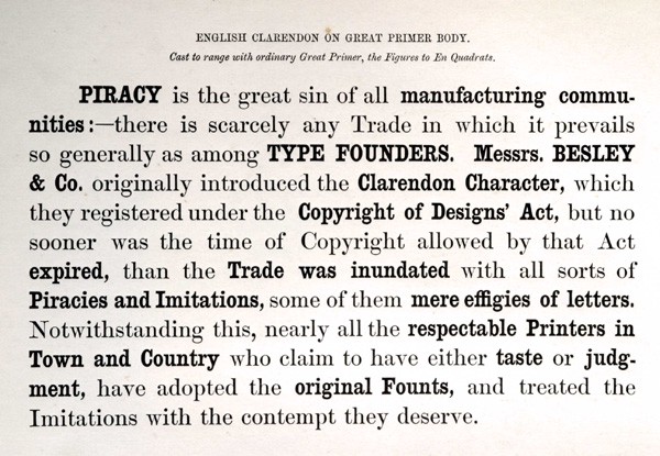
Editor’s note: Early this year we stumbled upon an endearing typeface called Oi Tamil (get it here). One could imagine Tamil film names on film posters or brand names and tag lines across billboards in this typeface. We loved its loud, curvy and chubby form and wanted to know more. Well, it search took us to a big-fat Oi! family of plump and playful typefaces. We spoke to its designer, Kostas Bartsokas and found that Oi!’s roots go deeper, to the “grotesque slab serifs, most specifically the style that sprung with the release of Caslon’s Ionic in 1844 and typeface Clarendon by Fann Street Foundry in 1845”. Well, if that sounds French to you, Kostas has given a fitting punch-line to Oi!—A CLARENDONESQUE ON STEROIDS.
Oi! won the TDC Award of Excellence in Type Design, 2018. Oi Tamil was was launched very recently. Kostas developed Oi! Tamil in consultation with Dr Pria Ravichandran, his partner, whose practice is focused on south Indian scripts. “She was there consulting me through the whole process, patiently letting me try out crazy ideas and then helping me figure out how to make them work for each letterform. I had a lot of fun working on the Tamil,” he says. Tamil is the first South Asian script in which Oi typeface is designed. While Kostas did pick up a few words in Tamil, overall he found the language difficult to learn. “However I have tried to write the Tamil script and this is one of the valuable lesson when trying to design for a script you are not familiar with. Even so, I would not feel comfortable releasing it without the consultation of a local expert,” he says.
Kostas Bartsokas writes the fascinating story of inception and creation of Oi typeface. Read here:
Once upon a time…
It all started in October 2015, when I was one month into my MATD at the University of Reading. In one of Dr Gérard Unger’s lectures, he raised the issue of how attributes or qualities are assigned to typefaces, and whether these are inherent to the design or ascribed by our individual aesthetics and cultural background. As a follow-up to the discussion, he asked us to design two typefaces — a few characters of each, enough to showcase the core idea — to correspondingly reflect our perception of public and private. The results across the classroom were captivating. It was surprising to see the variety of interpretations of the meaning of these two words, let alone how these translated into letterforms.
Since the time we had was limited and the exercise put little emphasis on the value of the design itself, I didn’t spend a lot of time on sketching — not that I usually do; instead, I roughly outlined some ideas on paper and then continue directly on the screen. My private typeface was a cursive yet angular and spiky design, comprising lowercase connecting letters. The cursiveness added the private (as in personal) note and the spikiness and angularity made it less inviting to strangers. Moreover, the way it was designed, each word image is shaped by a single outline, the black of the ink becoming an impenetrable and well secured private space.
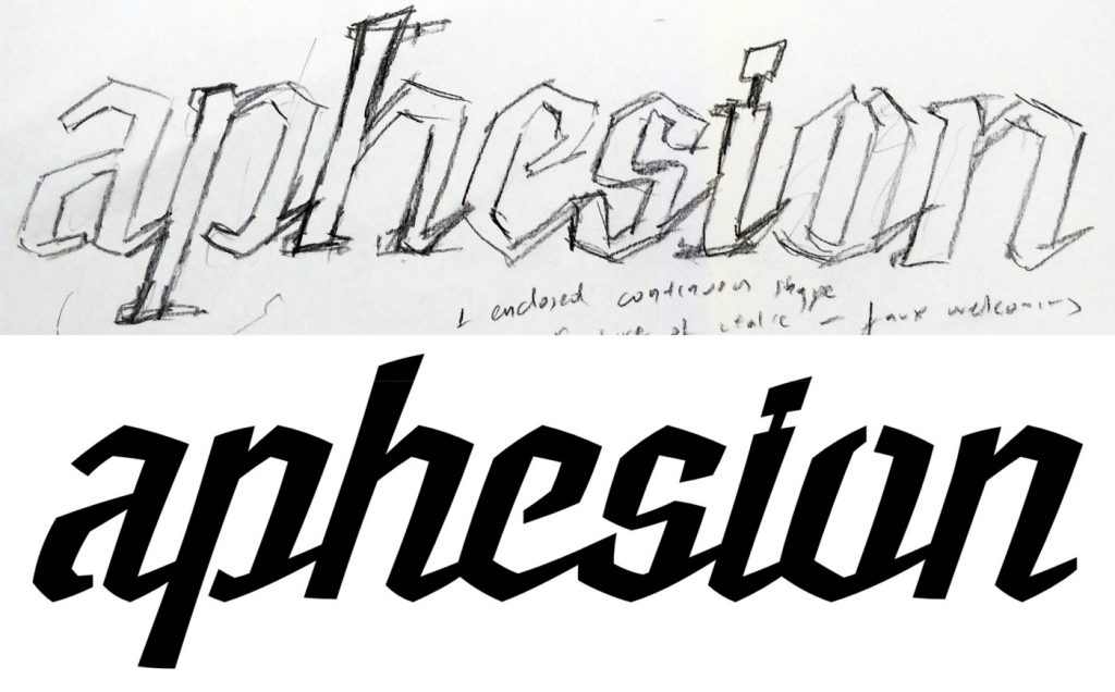
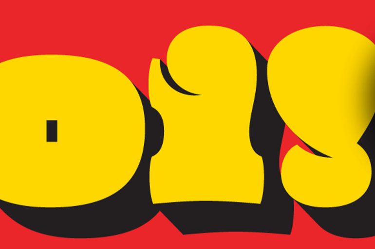
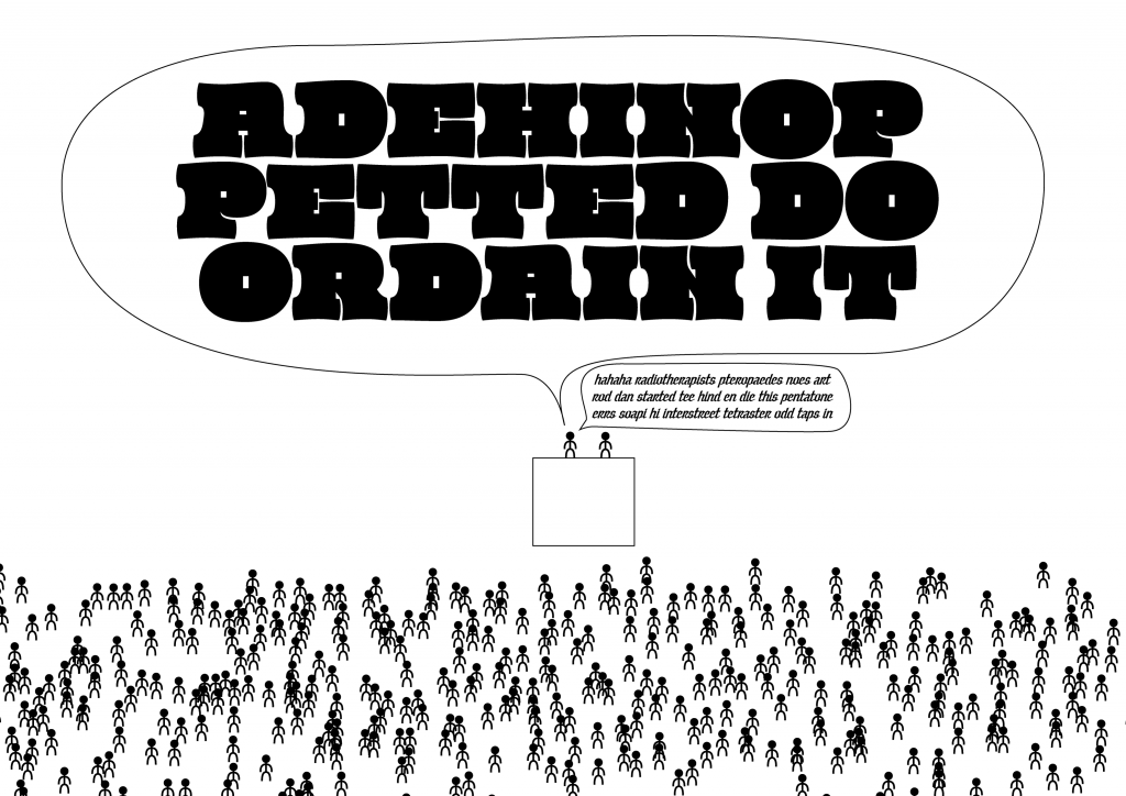
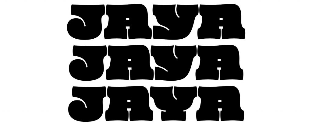
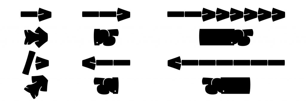
Contrastingly, the public design had to shout as loud as possible. I imagined it as an ultra-fat uppercase-only typeface, with letters occupying as much space as possible. The kind of type you would use to set a few characters inside a speech bubble and make a bold statement. Not thinking of any specific model, I intuitively added serifs to my sketch which due to the overall bulginess curved and merged into the stems. To keep the white space between the letters to a minimum, the serifs had to be very narrow and to compensate for the lack of width they had to be very fat. Square counters, included in the digitisation, added an extra element of dynamism.
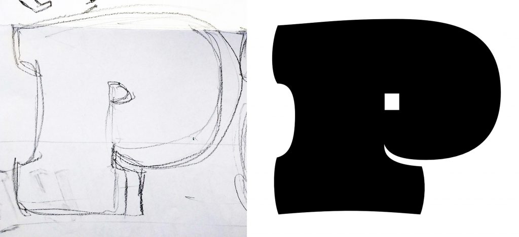
Both Public and Private got a basic character set and were reviewed by Dr Unger. He found the contrast between the curvy outlines and the square counters of Public interesting and remarked that the idea was worth further exploration. However, at the end of the workshop, both projects were left aside since there was much work to be done on more important stuff.
Opening good ole files
Fast forward to August 2017. Due to unforeseen circumstances, I was stuck in Reading without any summer holiday time. I needed to let some ‘design’ steam off and my thoughts went back to the words of Dr Unger on Public. I opened the files and had a fresh look at it. At that point, I had no intentions of completing the project, but the design looked intriguing enough to justify spending time on it.
Reopening the files revealed a problem with the design. There was an idea but it was based on some mental image of mine and not on any specific model. I needed to somehow ground it and find a focal inspiration point that would drive the design cohesively.
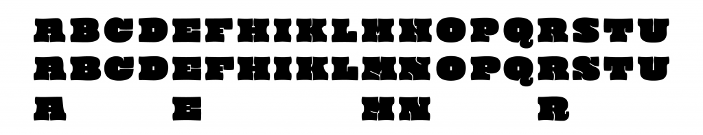
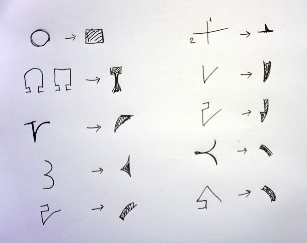
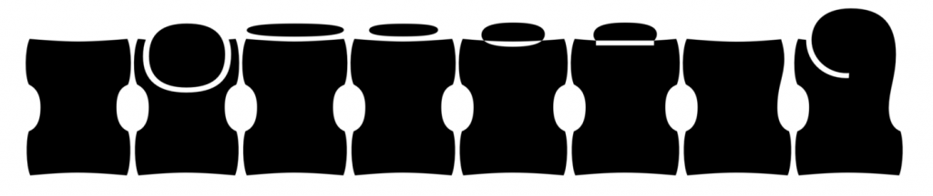
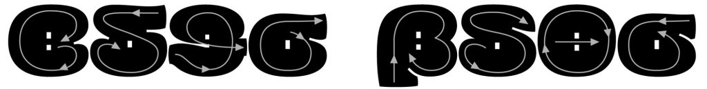
The bracketed slab serifs immediately got me thinking of Clarendon. Clarendons were bland, mechanical designs with heavy sturdy bracketed slab serifs, vertical stress, and low contrast. Small details, like the ball terminals, ornament them enough to create an appealing character ideal for display purposes. The idea of using them as my base camp was a no-brainer.
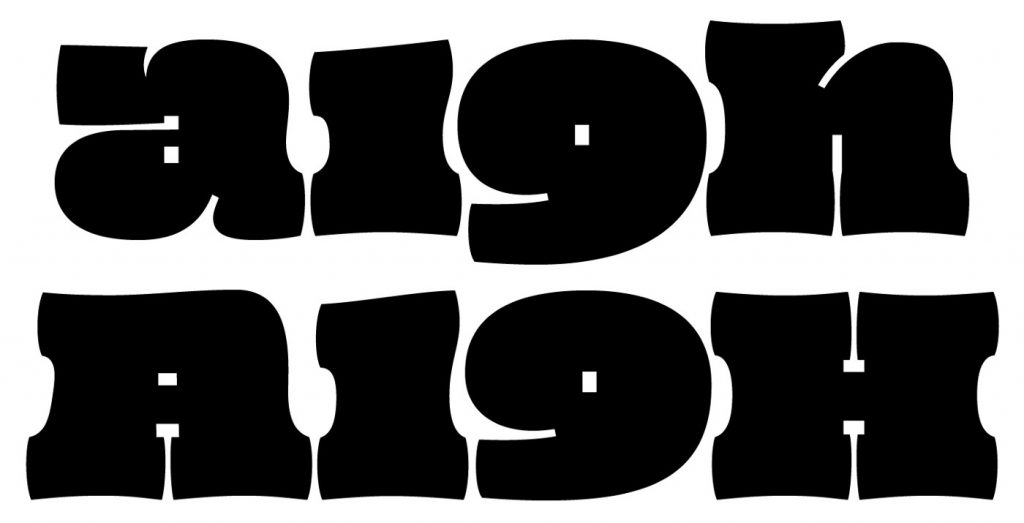
I started working on the uppercase, reworking and refining letters (such as N and M), while maintaining some details from my original design (like the apex of the A extending to the left). Some of the Clarendonesque features were hard to introduce (like the spur of the R) but others made it through (like the ball terminal in the J). The Y created an awkward white space so I decided to break the rule and design a cursive version that locked better with other letters (and even has a contextual alternate for further improved locking). A non-cursive stylistic alternate is also available (ss01).
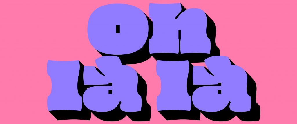
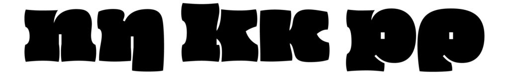
Though it was not my initial intention, I did eventually accept the challenge to work on the lowercase. In order to fit well with the uppercase, I pushed the x-height really high and kept the ascenders and descenders to a minimum, still allowing letters to be distinguishable. This made it very economical in its vertical metrics and ideal to set with tight line spacing.
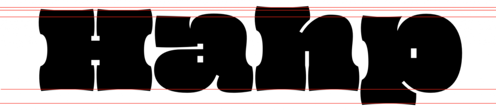
Due to their blocky character, uppercase letters were easier to squeeze closer together. The lowercase produced problems with the proportions of their parts, nevertheless, in many cases, I went for the spirit rather than a better fitting solution (i.e. the r with the huge ball terminal). Working on them gave me the chance to rethink the rules that define outlines and shapes. This resulted in going back and forth between lowercase and uppercase readjusting minor details, like the depth of the cuts and the size and look of terminals.
One idea that elevated the spirit of the design came when I was tackling the i and j. I wanted the typeface to be as compact as possible on the vertical axis, and so I tried various solutions to minimise the height of the tittle. Finally, merging the tittle to the stem revealed the route I had to follow for the rest of the diacritics. If any native users would like to challenge some of the solutions I chose, I would be happy to discuss them over beers!
Numerals, punctuation, symbols
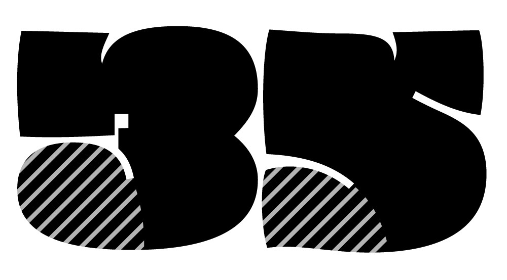
Clarendons featured lining numerals yet, I decided to make non-lining the default since they do work better with the lowercase. I added an alternate lining set, but instead of providing the user with a choice (via onum and lnum) I kept it exclusively available for all caps setting (case).
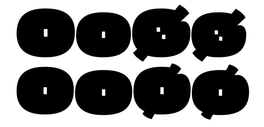
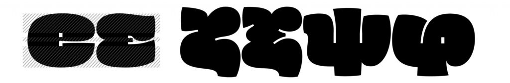
Designing the numerals proved more difficult than I anticipated and in order to balance shapes and keep the weight consistent, I had to handle similar paths differently (i.e. the terminals of the 3 and 5). Both lining and non-lining zeros are very close to the O and o — they are all slightly different but the shape is very primitive to allow for major alterations. Opentype features to the rescue; there is a slashed zero (zero) available in both sets — and it is different from the Ø and ø!
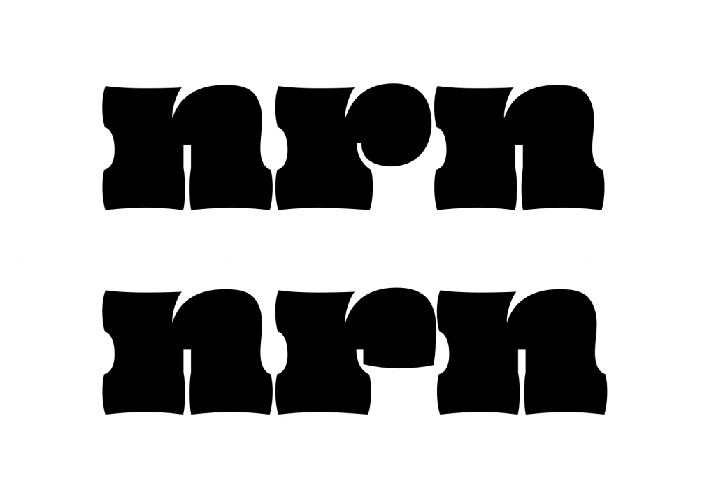
The treatment of the diacritics gave room for experiments with the punctuation and the symbols. Strokes that are too close overlap, following the same principle as the diacritics, allowing for economy on the horizontal axis. My favourite symbol is the extending manicule, which can be accessed via the discretionary ligatures (dlig). Give them a try and use them at your discretion.
It’s all Greek to me
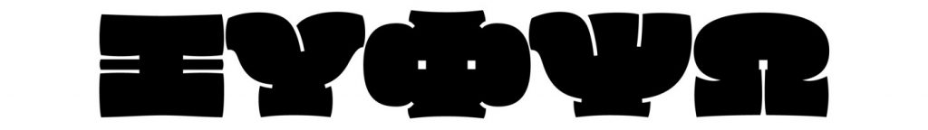
The playful character of the design and the challenges of applying the idea to the Greek script made it impossible not to do it. The cursive character of the script, allowed me to move away from the rigidness of the Clarendons and design something more free-spirited and playful. The uppercase Greek and Latin share many identical characters, but I still had to come up with solutions for letters consisting of multiple strokes such as Ξ, Ψ, and Φ.
Greek lowercase letters are full of character. To avoid Latinisation, I had to come up with solutions to harmonise the colour and the weight to that of the Latin (i.e. tapering stems, adding in-strokes and out-strokes). The same problem of crowdedness that occurs in uppercase is also observed in lowercase (φ, ψ), and I tried to balance the overall weight without making the letters too wide. For others, such as ε, I followed solutions already applied in the Latin. I could not resist adding a few additional alternates that relate to the ductus of the stroke (β, δ, θ, σ accessible via ss02).
Stopping is a hard thing to do
At the point where all of the above was done, I decided to put a full stop on the project for the moment. It had gone beyond my original plan and by this time I had made up my mind to release it under a — limited — free licence, so there was no way of knowing if it will ever pay for the time invested in it. However, the full stop was more of a semicolon. That same evening I found myself experimenting with a shadowed version, adding another layer to the design. Thanks to Rainer Erich Scheichelbauer’s Shadow plugin and some manual refinement, soon enough I was done with the whole character set.
Even though it was tempting to keep experimenting with more shadows and layering I pushed myself to finally put that full stop. I had to come up with a suitable name for the design. Oi! A very common interjection broadly used in the UK (and especially up in Leeds where I spent some years earlier in my life) felt perfectly suitable for the design. The specimen was done with the help of Shani Avni and the mini-site was coded by Apostolos Christodoulou. Thank you both!
***
Kostas is a type designer and font engineer. He holds an MA in Typeface Design from the University of Reading and has worked as a senior type designer at URW and as a freelancer consultant and designer, creating original typefaces and expanding script support to Greek and Cyrillic.
A version of this article was published in Medium.