On April 1, 1976, a black and white morphing eye stunned India when it aired on grainy television screens across the nation, relayed by the country’s first broadcast service, Doordarshan. The minute-long animation, which saw the abstracted eye spiral out before stabilizing into a static symbol, marked a seminal moment in Indian history: it was most of India’s introduction to television. Until 1975, television was only available to residents of seven Indian cities. This broadcast service, and its decidedly modern logo, signalled the dawn of a new culture.
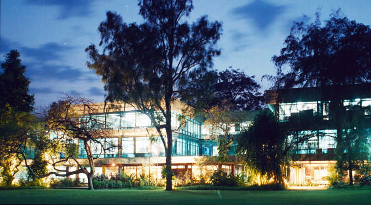
Fittingly, this groundbreaking identity was born in a classroom in India’s first design school, the National Institute of Design (NID), located in the westerly city of Ahmedabad. Much like the Doordarshan logo, the concept of design education—and the notion of design as an academic and institutional pursuit—was a novel one in India at the time. It was at NID that a celebrated group of design thinkers, practitioners, and educators learned their craft.
The exhibition whetted India’s appetite for modern design, and it was one of the many forces—both global and local—that led to the founding of NID.
The inspiration for NID traveled from the Bauhaus and, years later, the Ulm School of Design in Germany. But long before the plans for India’s first design institute had been made, ideas from the Bauhaus had already found their way to the country. In 1922, an exhibition at the Indian Society of Oriental Art in Calcutta introduced the works of Bauhaus masters and students of the Weimar period, including the paintings and graphic works of László Moholy-Nagy, Wassily Kandinsky, Paul Klee, Johannes Itten, and Lyonel Feininger. They were later described in reverent detail in Rupam, India’s most prestigious journal of culture at the time, and inspired debates among the students and teachers of the Kala Bhavana Institute of Fine Arts in Shantiniketan, a small town in the state of West Bengal. The exhibition whetted India’s appetite for modern design, and it was one of the many forces—both global and local—that led to the founding of NID.
In 1958, they drew up their observations in The India Report, where they suggested that the Indian designer could be the connective tissue between the perceived traditional past and the modernity that the country was revving up to embrace. This report outlined the contours of a design training program that would become the inspiration for the founding of NID.
In 1955, hundreds of miles from India, another such formative event was unfolding in New York. Pupul Jayakar, a cultural activist and writer on Indian craft traditions, met Charles Eames at the Museum of Modern Art and the two began a lifelong dialogue. On a grant from the Ford Foundation, which Jayakar helped them receive, the Eameses traveled across India, interacting with writers, craftsmen, architects, scientists, and industrialists. In 1958, they drew up their observations in The India Report, where they suggested that the Indian designer could be the connective tissue between the perceived traditional past and the modernity that the country was revving up to embrace. This report outlined the contours of a design training program that would become the inspiration for the founding of NID.
Simultaneously, architect Le Corbusier was introducing his concept of modern design to India through another means, creating several buildings there during the 1950s. One of these, the Sanskar Kendra museum in Ahmedabad, became the grounds on which the idea for NID was conceived. Meetings were moderated by industrialist Gautam Sarabhai who, along with his sister Gita, played a significant role in establishing the institute. As Professor H. Kumar Vyas, an industrial designer who was also one of the first teachers to join NID, recalled in a 2010 interview, “Gautam always began at the basics. Here, the basics pertained neither to design, nor design education, but the concept of education itself.” Huddled in the attic of the museum, Sarabhai asked a group of intellectuals questions as basic as “What is education?” and “What is design?” They were tasked with creating a curriculum for a field of education that was unheard of and introducing a profession that did not yet exist.
In 1961, the National Institute of Design was established in Ahmedabad. Sarabhai side-stepped the prevalent educational system protocol, which was still reeling under a colonial hangover that had always prioritized theory over practice. Instead, “he strove to establish the efficacy of the Bauhaus postulate—‘learning by doing’ that prompted a simultaneous learning of theory and practice,” writes Professor Shilpa Das in 50 Years of the National Institute of Design 1961-2011. “Later, in relation to a design process that begins with the need to know the nature of a problem, he rephrased it as ‘learning to know and learning to do.’”
With that, the pedagogical approach was set, but NID had another problem: in a country previously without a dedicated design school, there were also no design teachers. In 1964, an advertisement in the Hindustan Times called for art, engineering, and architecture graduates to join the NID’s educational and training program. These students, who were essentially being trained to become the first NID teachers, were sent to institutes across Switzerland, Germany, Italy, France, and England for further education. By 1969, 25 of the 60 faculty trainees were absorbed as teachers, while the rest worked as India’s first generation of design professionals and educators. That same year, NID ushered in its first “real” students.
The NID’s Foundation Program drew on the pedagogies developed at the Bauhaus and at the Ulm School of Design. It wasn’t until almost a decade after NID’s opening that the Foundation Program would truly find an identity of its own, underscoring the importance of translating other design pedagogies for an Indian context. This was achieved through professor Mohan Bhandari’s environment awareness course, in which students would choose a micro-environment in or around Ahmedabad to visit, closely studying the area’s shops, homes, temples, and food carts. Over the four month semester, they critiqued and recorded their chosen area’s lifestyle, sanitation, and hygiene through detailed sketches, sharpening their senses and highlighting the relationship between humans and the spaces they occupy.
Over the years, the institute turned out some distinguished graduates, including graphic designer Vikas Satwalekar, type designer Mahendra C. Patel, educator and design thinker M.P. Ranjan, animators Ishu Patel and R.L. Mistry, product designer S. Balaram, and graphic novelist Orijit Sen. A collaborative spirit thrived in NID’s classrooms, which the school referred to as “studios.” International designers like Armin Hofmann, Bob Gill, Adrian Frutiger, Ivan Chermayeff, and architect Louis Kahn were invited on campus, where they would often spend weeks creating challenging briefs and developing projects alongside the students. Studios were a sacred place—a space of unfettered experimentation, where the design process was trusted and relied on completely.
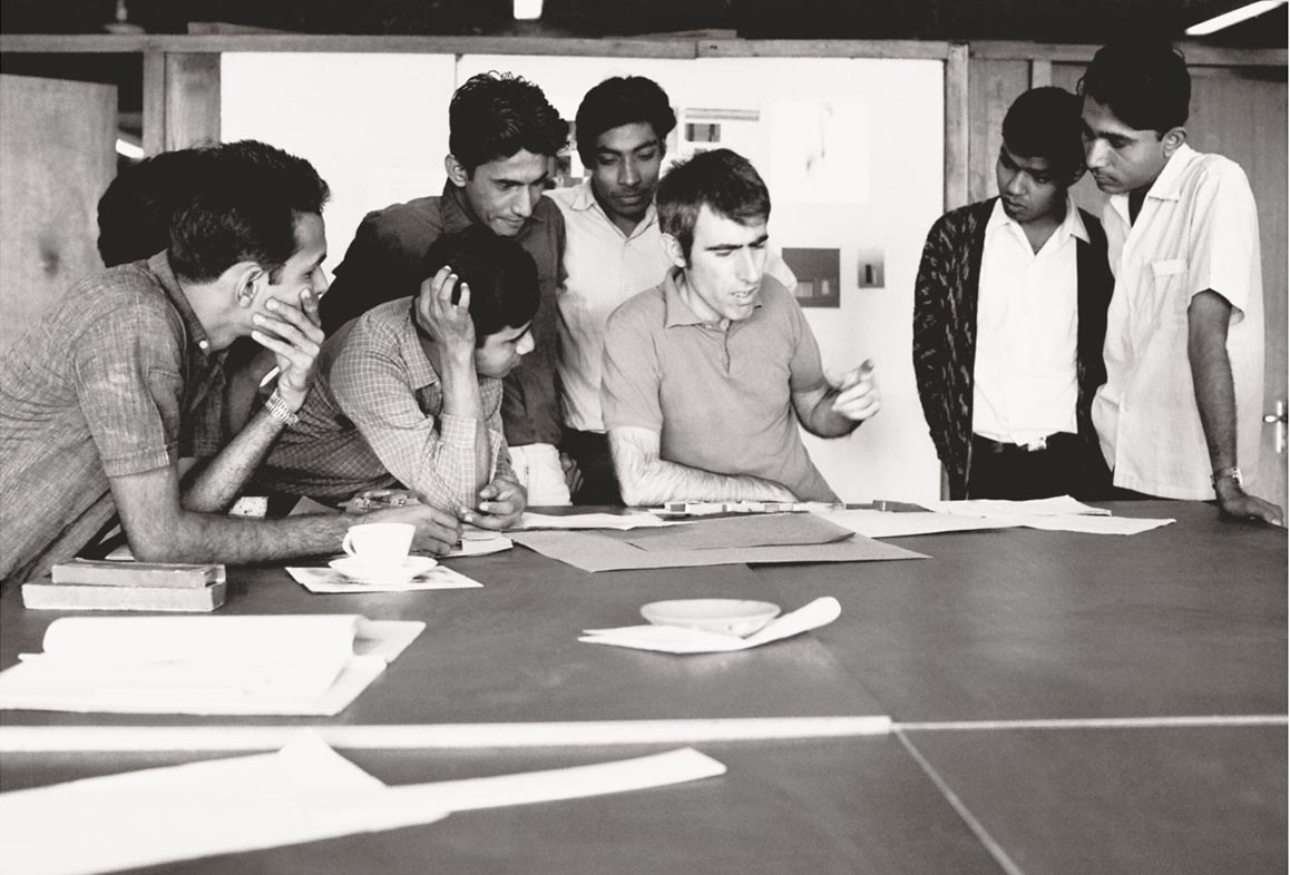
It was in one of these studios in the ’70s where eight graphic design students created the identity for Doordarshan. Devashis Bhattacharyya drew a circle for the eye and created two bulbous curves around it, depicting “the yin and the yang.” The importance of the mark was not lost on him. “The challenge with this project was to communicate the idea of television before half the country had even seen the machine,” Bhattacharyya said in a 2017 interview. “The eye alone doesn’t make sense. You don’t just see, you also hear television. The interlocking of the curves and the space between them is about getting information and transmitting it.”
Prime Minister Indira Gandhi picked Bhattacharyya’s work from the 14 designs sent to her by NID. Mistry later animated the symbol by making copies of Bhattacharyya’s design and shooting them with a camera, rotating the image until it formed the final symbol. The animation was accompanied by music composed by Pandit Ravi Shankar. According to Vikas Satwalekar, the “DD eye” was the first classroom project that NID sold to a client.
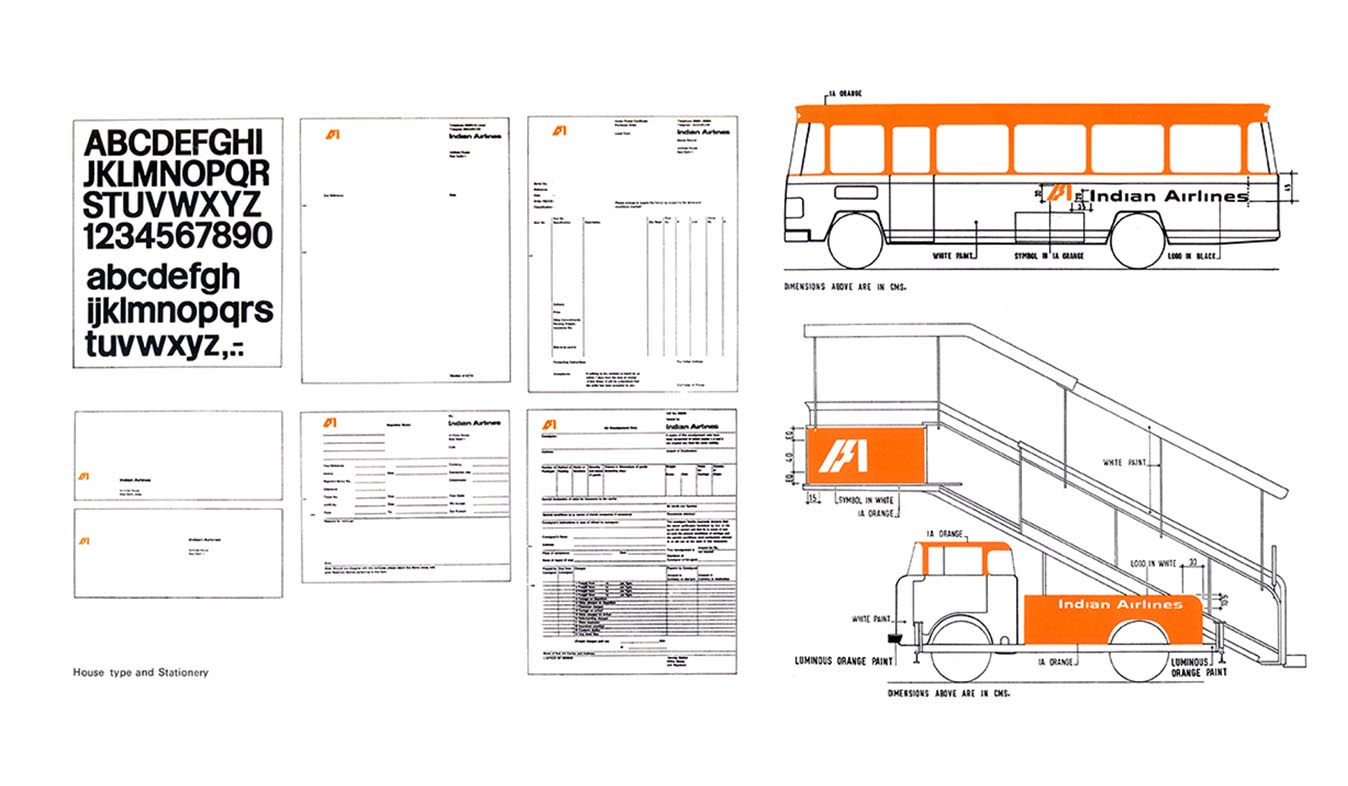
Through its early projects in the late ’60s and ’70s, NID set the stage for modern Indian graphic design, and crafted its own visual language. In 1967, the Indian Airlines Corporation commissioned NID to design its visual identity. At the time, flying was considered a revolutionary technology in India, and the resulting logo needed to encapsulate that. The Yale-educated graphic designer Benoy Sarkar started experimenting with the letters IA, while Vyas worked on the color scheme. Gopinath Rao, one of Sarkar’s students, remembers the maestro sketching innumerable iterations of the lettering. “He would put the bars in combination, one with a slope, and look at it for hours as if it had a life of its own. Then he would come and ask us, ‘Hey, what do you think? Does it look like an IA?’ With great hesitation, we would say, ‘No!’ and he would go and work on it again.”
Never one to call it quits, NID continued to work on the project in the form of a study program and developed an identity manual together with Ivan Chermayeff